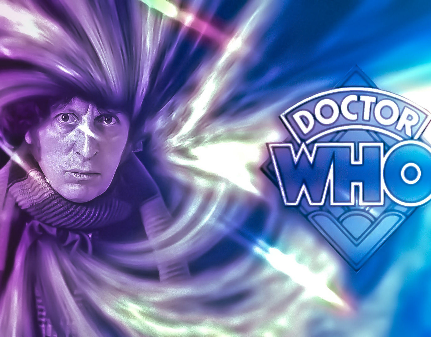
Doctor Who | 2013 Series 7B Title Sequence Concept
All the following imagery was designed to form a prototype of the projects structure unless explicitly stated otherwise.
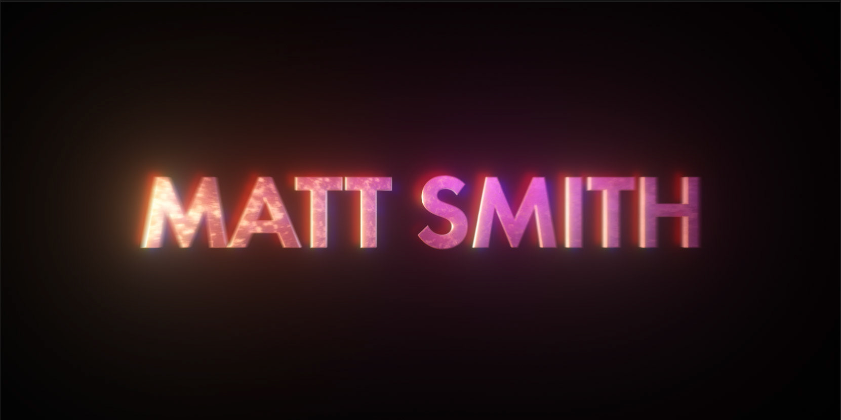
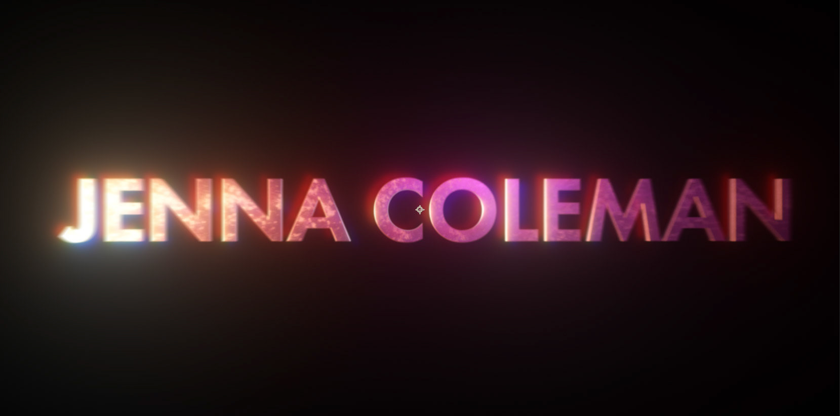
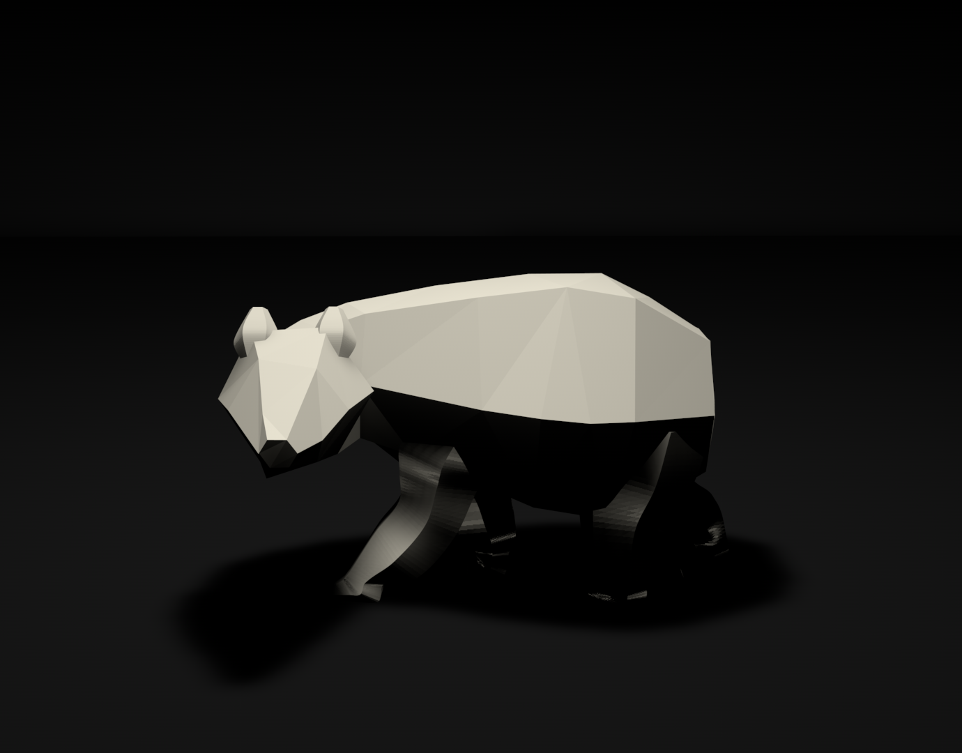
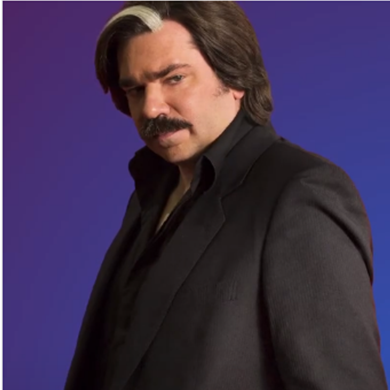
The name cards themselves were designed in Cinema 4D and exported with Octane Renderer. A backlight was used to represent the sun in the background and two area lights were used elsewhere for foreground colouring and illumination. These lights were increased to a high brightness level and then the exposure of the assets was lowered. This was done to remove hotpixels and fireflies, a major issue when rendering dark areas straight into Octane.
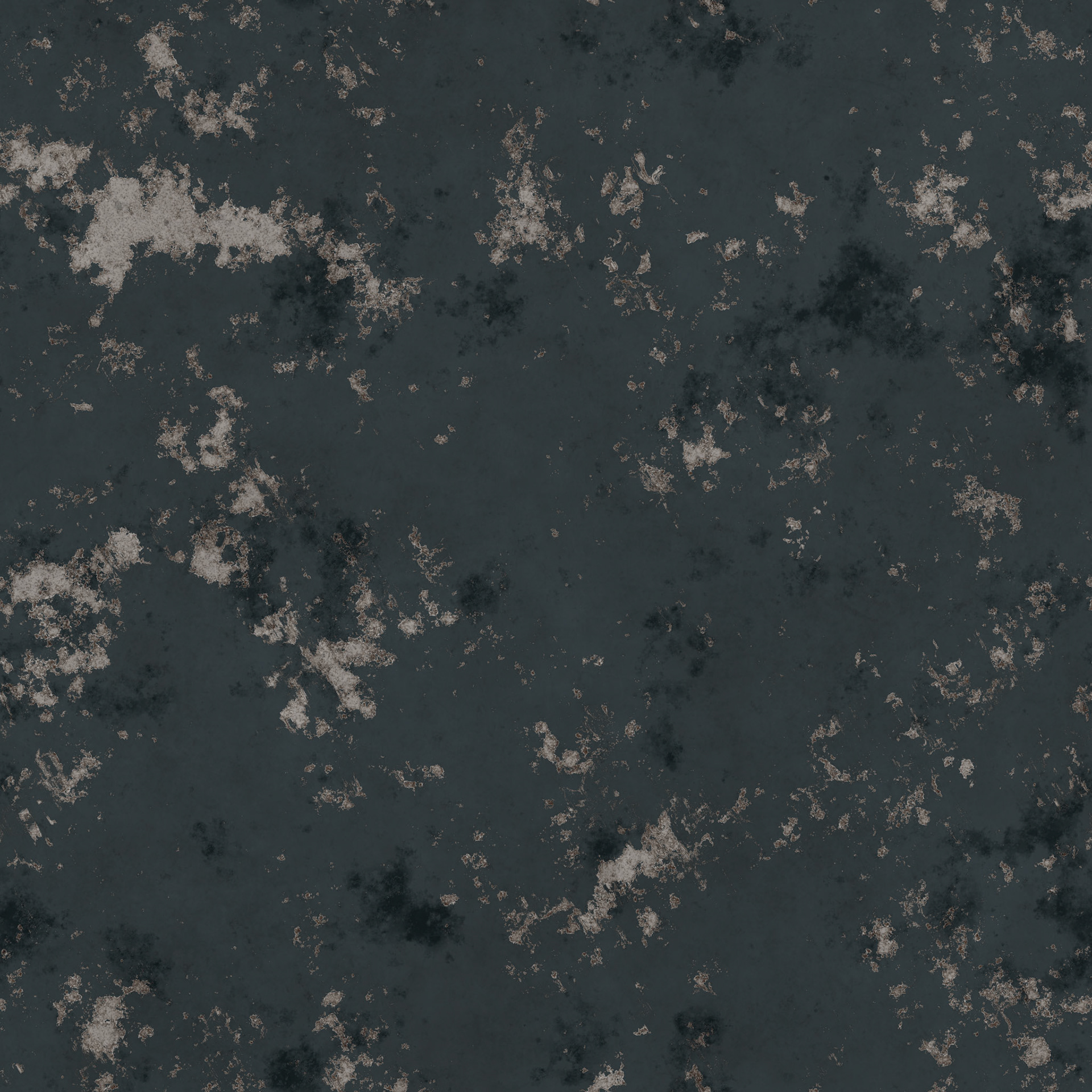
The texture for the text (below) was from my asset library so I can't remember exactly where I sourced it but if you know then notify me and I'll provide credit.


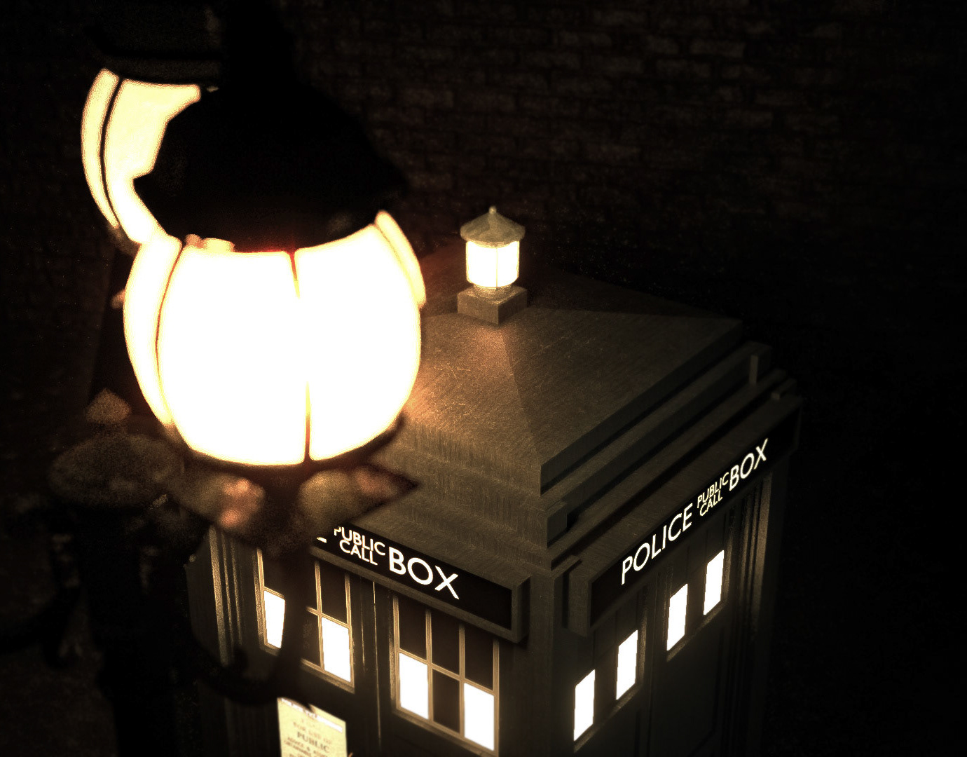
Below was the original opening shot, while I believe it does look relatively good, it simply didn't fit with the pace I was planning to set in the beginning quarter of the sequence. It's definitely a better alternative to the original opening shot of the official sequence, I read that amongst the stock nebula images used in the titles there is a man on the toilet. I assume this is false but would love to see if I could implement it into my own version.
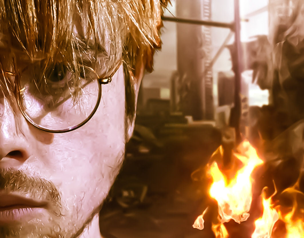
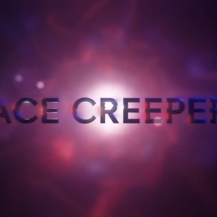
After some basic compositing for the name section I came up with this frame style. I'm not sure about the colouring but that will almost definitely change in the future.
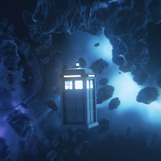
After repurposing the opening shot I decided to turn my attention to the TARDIS flight sequence. I'm happy with the motion but the lighting of this shot is really bothering me. I'll take any tips you have on improving below.
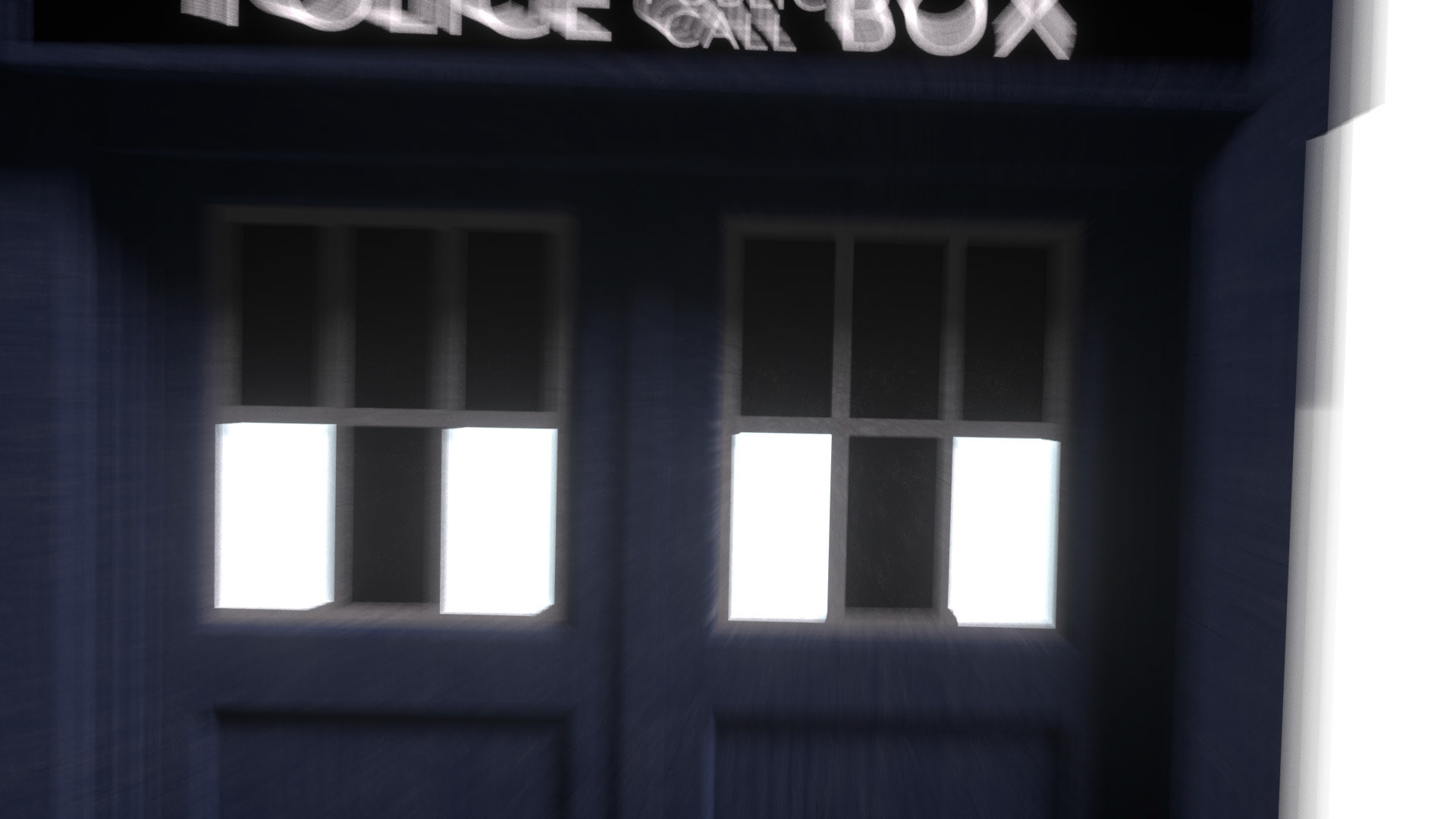
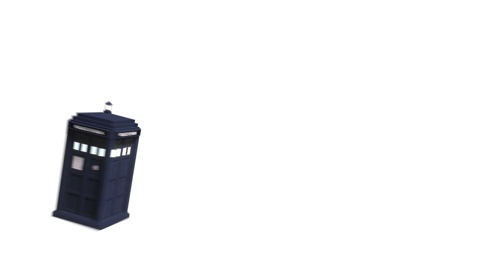

I could use a HDR but the results never really astound me, if anyone has any secrets regarding how to boost the results, let me know :)
